Week 4: The Self and Identity

This week begged the question of who I am as a designer, but in a deeper, more critical way of thinking. Martin Hosken's lecture was on this week's lecture, and boy.. what a lecture it was.

When I think of myself as a designer, I tend to think on a very surface level, it seems. Just about simply what I like, maybe what I envision a client liking, and if it's work that I am happy doing at the end of the day. Listening and diving deeper into this week, it inspired me to question a psychological level of why design.
There was a question by Martin that stuck with me:
How can Graphic Design enable you to communicate your core values at this point of the course?
I believe as a whole, my representation is within my work itself. I enjoy a more gritty style, always have. Designing safely has never been my forte. I always try and think outside the box. Graphic design allows me to express my individuality, personality of uniqueness, and freedom within a digital canvas. Sadly, I think a lot of companies, professionally at least, aren't too big of a fan. Especially in your typical social media post, flyer, etc.
It really boils down to finding the right niche within design. And I think at it's core that's why I connected so much with sports. It was something different and wasn't locked down by corporate briefs as much. Each team had its own identity, history, and culture. I can recall the second I chose design over Criminology, I knew this was the path I wanted to take.
Lecture
This week's lecture brought up a very complex question about identity and design. From nudge theory to archetypes, Martin Hosken utterly made me think this week.
He brought up themes of what the unconscious was, with terms such as "ego," "the iceberg model," and what it was to be an introvert and an extrovert. I had never thought that a social type had an effect on design previously, but alas, I was wrong. Hosken taught me what the archetypal self is, with themes such as the hero's journey and titles.
This having an effect on branding and advertising throughout industries, using that information is order to sell goods and/or services to that specific crowd.. quite clever. Somewhat evil, but clever none the less. Profit is needed at the end of the day.
Consumerism is fueled by a culture desired around it. This began in around the 1920's according to Hosken. Having said that, the element of consumerism is still very much around today. Looking at my desk alone I have a majority of items purchased simply out of this idea. Did I need a light up keyboard..? Certainly not.. Or how about a mousepad that has a piece of art I like? Nope. Guilty as charged. This lecture had me rethink my habits a tad and does all this really make me happy? I guess time will tell.
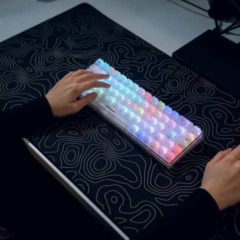
This began the rise not only of who the self was, but also of the digital self. As the quote in the lecture:
'I can be googled therefore I am'
An online presence is forever and ever have precedence over a real-life footprint in today's world, in my opinion. sad, but society has transcended that way.
Research
For research this week, I wanted to look more at simplistic design. A style I'm rather uncomfortable with. But more specifically Scandinavian minimalism. Throughout my time as a designer, there were a multitude of clubs such as Malmo FC in Sweden that came to mind. With their clean and less-or-more attitude... I couldn't help but sift through their work in awe.
From the clean whites to the light blues, it gives me the fire under my second project to try and do something similar this club has done. It's an art form I've never attempted given my gritty ways, but something I'm open to trying in the near future.
As for more depth into the elements of Scandinavian minimalism, I found myself at an article from Olga Lany from Admind Agency.
In her article, she brought up the key characteristics in Scandinavian design as she states:
Functional minimalism: Not minimalism as an aesthetic stance, but as a principled commitment. Every element has a purpose and earns its place. Decorative elements that do not communicate are eliminated.
Democratic accessibility: Design should be accessible to all. Clarity, legibility and usability are not secondary considerations. They are the primary measure of quality.
Connection to nature: The Nordic landscape, with its fjords, forests, light-filled summers and dark winters, permeates Scandinavian design. Natural forms, organic shapes and a restrained yet expressive colour palette inspired by nature are constant reference points.
Typographic rigour: Sans-serif typefaces, generous line spacing, left-aligned text, and clear hierarchy. In Scandinavian design, typography is never just decorative.
Honesty of materials: In graphic design, this translates to a preference for transparency about what something is and what it does. No false promises or visual noise.
Balance between restraint and boldness: In particular, Finnish and Danish design has a tradition of bold, joyful colour and pattern that coexists with and sometimes comes into productive tension with the prevailing minimalist tendency.
Craft and precision: Scandinavian designers have always prioritised the quality of execution. They believe that the right solution, when executed well, is the complete solution.
Given these factors, it gives me the confidence to push forward into why this type of design is. I'd like to think a huge reason why it's so simplistic is due to it's connection of nature. The photography takes lead over the text.
Task
As for my task this week.. I was asked to:
Create a mood board of images and typography that conveys the values of who you are as a designer. Include a range of work from your favourite designers and artists but try to keep the aesthetic of your mood board thematically consistent.
Given the theme of Scandinavian design this week, I decided to go all in with that aesthetic as seen below. Hope you enjoy!

References
Malmö FF (@malmo_ff). (n.d.). https://www.instagram.com/malmo_ff/?hl=en
Lany, O. (n.d.). How Scandinavian Graphic Design shapes modern branding?. Admind. https://admindagency.com/scandinavian-graphic-design-and-modern-branding/
Premium gaming keyboards. Higround. (n.d.). https://higround.co/?srsltid=AfmBOop5Q3uMxcclkWL3VKgQylokF8nlHpAt0stVLKEEHUGiOE4IXWAm


Comments